Building a KPDCL Electricity Dashboard Without an API
I showed someone the KPDCL electricity dashboard I had added to Glance, and the first thing they asked was: what's with the yellow bar?
Fair question. Sixty bars of daily electricity consumption, and exactly one of them was amber. That bar marked the highest-usage day in the window, which is what I meant it to do. What I had not meant was for it to be the only bar on the chart rendering a color at all. The other fifty-nine were black, on a black background. Nothing had errored. I had looked at that chart, decided it was done, and moved on.
TL;DR
I built a KPDCL electricity dashboard because Smart BS Plus exposes prepaid balance, usage, statements, and complaints through a consumer portal but offers no documented consumer API or supported export. A Go client stores the meter readings in SQLite, and an exporter computes chart geometry for Glance. That works, but it moves rendering bugs into a layer that has no way to fail loudly: an undefined CSS variable made most of the SVG bars invisible and the monthly comparison meaningless while the page still returned 200.
Getting electricity data out of KPDCL
My electricity connection is prepaid through Kashmir Power Distribution Corporation Limited (KPDCL). A smart meter records each reading, KPDCL bills against a prepaid balance, and when that balance runs low the supply can stop. Smart BS Plus publishes the useful account data through a consumer portal: balance, daily consumption, statements, and complaints. What it does not provide is a documented consumer API, a supported export, or a CSV.
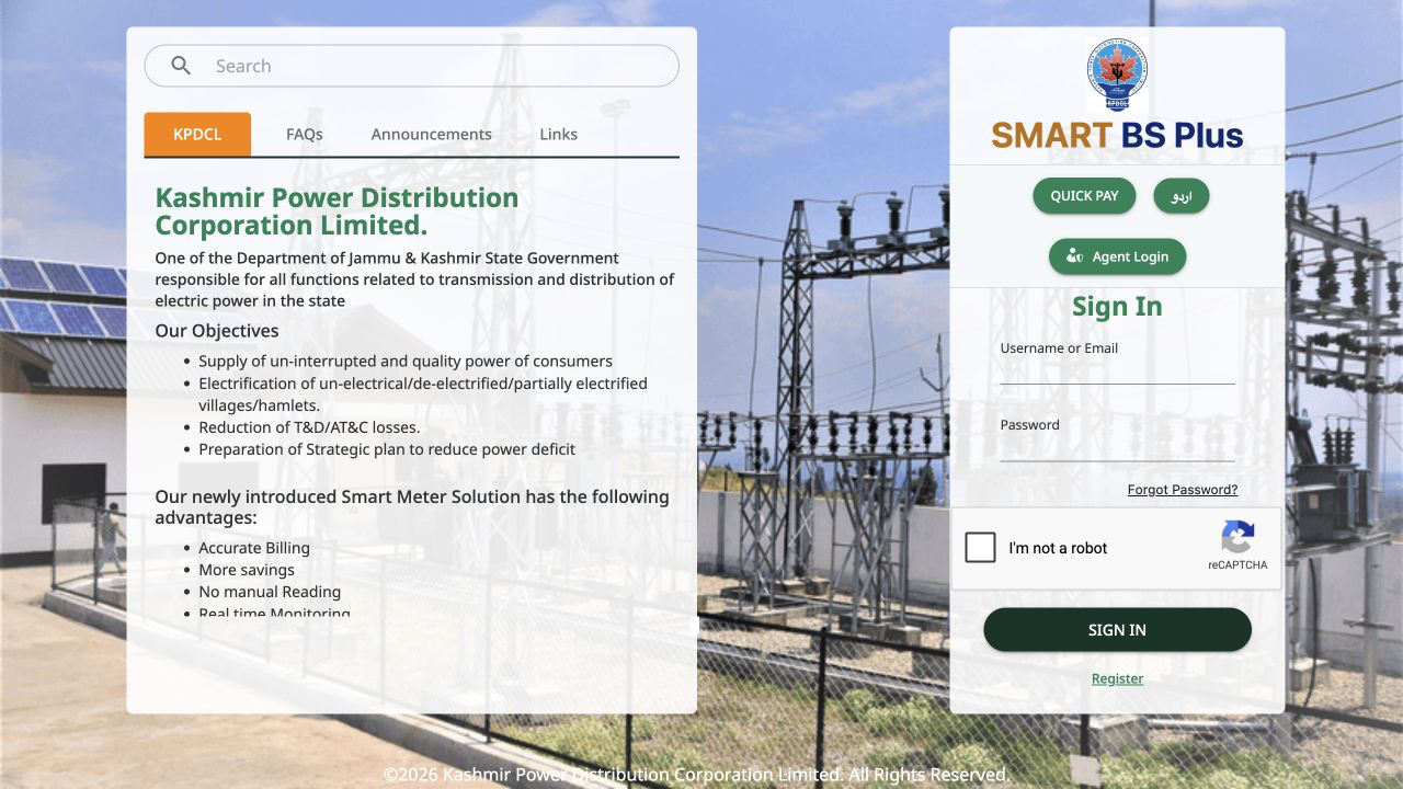
The official Smart BS Plus portal exposes the data to a signed-in KPDCL consumer, but not as a documented API or export.
That is the ordinary situation for much of the data about your own life. The interesting number exists, someone is already computing it, and the only supported way to see it is to log into a page and read it with your eyes.
So I wrote a client. It authenticates once, caches the session token for twelve hours, and pulls usage, balance, the account statement, and open complaints into a local SQLite file. It is about three thousand lines of Go, and most of that is not clever: it is the accumulated knowledge of which parameter names the backend actually accepts.
Some of what I learned tracing the portal's own frontend, recorded because it is easy to get wrong:
- Every date-ranged endpoint wants
DD-Mon-YYYY. SendDD-MM-YYYYand you get an HTTP 400 with no explanation. - The usage endpoint requires both
fdateandtdate. Omit either and it is a 400. - The account statement parameter is
acctId.accIdis a 400. - One tier authorizes on an
x-useridheader, where consumer-scoped endpoints want the consumer code and account-scoped ones want the user id. Same header, two meanings.
None of that is documented in KPDCL's public consumer material. All of it is discoverable by tracing the requests the Smart BS Plus frontend already makes. This is an observed implementation, not a contract: KPDCL can change it without notice, so the client records sync failures and keeps serving the last complete local history. The payoff is that I now have 381 days of daily readings in a file my backup job already covers.
The interesting number exists, someone is already computing it, and the only supported way to see it is to log into a page and read it with your eyes.
How the KPDCL electricity dashboard is wired
The KPDCL electricity dashboard pipeline is deliberately boring. A scheduled job runs the client, the client updates SQLite, and a small exporter turns the database into one JSON file that a static file server hands to Glance.
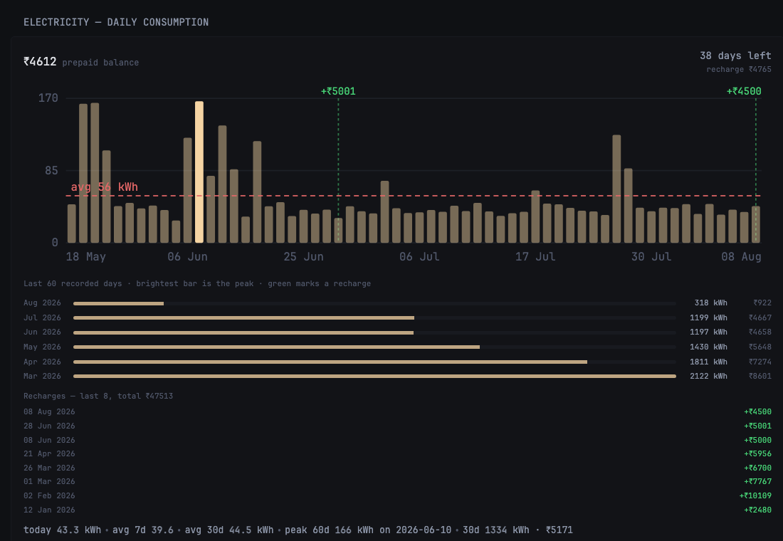
The relevant section from the live smart-home page: sixty days of KPDCL consumption, recharge markers, monthly comparisons, and the current window statistics.
This follows the same consolidation principle as making a home server usable with one dashboard: keep small producers behind one operational surface instead of running a second UI for every dataset.
Caddy serves the file from a read-only mount, which is four lines and the same shape as every other JSON endpoint on the box:
@power host power.home.example.com
handle @power {
	root * /srv/power
	file_server
	header Content-Type application/json
	header Cache-Control "no-store"
}
The exporter writes to a temp file and renames it, because rename is atomic on the same filesystem and the alternative is serving a half-written file to a dashboard that polls every thirty minutes.
The template cannot do the math
Glance widgets are Go templates. A custom widget fetches JSON and interpolates values into HTML. What it does not have is arithmetic beyond printf, mul, and div. There is no way to normalize a series, invert a y-coordinate, or work out how wide sixty bars should be inside a fixed viewBox.
That constraint decides the architecture. If the view cannot compute, the producer has to. So the exporter does not publish "43.3 kWh on 8 August". It publishes the rectangle:
for i, r in enumerate(chart_rows):
    u = r["units"] or 0.0
    h = (u / axis_top) * plot_h
    chart["bars"].append({
        "x": round(PAD_L + i * slot + (slot - bar_w) / 2, 2),
        "y": round(PAD_T + plot_h - h, 2),
        "w": round(bar_w, 2),
        "h": round(max(h, 0.6), 2),
        "date": r["date"],
        "units": round(u, 1),
        # int, not bool: the template accessors are String/Float/Int
        "peak": 1 if u >= cmax * 0.999 else 0,
    })
And the widget becomes a loop with no opinions:
{{ range $b := $bars }}
<rect x="{{ $b.Float "x" }}" y="{{ $b.Float "y" }}"
      width="{{ $b.Float "w" }}" height="{{ $b.Float "h" }}"
      fill="var(--color-primary)"
      fill-opacity="{{ if eq ($b.Int "peak") 1 }}1{{ else }}0.45{{ end }}">
  <title>{{ $b.String "date" }}: {{ $b.Float "units" }} kWh</title>
</rect>
{{ end }}
That "peak": 1 rather than true is not stylistic. The template accessors are String, Float, and Int. There is no Bool, and a missing accessor does not warn, it just yields nothing.
What I considered instead
| Option | Why I passed |
|---|---|
| A charting library inside the widget | Glance renders server-side and a widget is a template, not a mount point for scripts |
| Render a PNG on a schedule | Loses theming and hover detail, and adds a headless browser to a box I want boring |
| Grafana alongside Glance | A second dashboard to run, secure, and back up, for one chart |
| Geometry in the exporter | Kept it |
The cost of the choice I made is real and worth naming: my data file now encodes presentation. If I change the widget's height or padding, I change the exporter. The JSON is no longer a clean description of electricity usage, it is a description of electricity usage plus a rendering intent, and a second consumer of that file would have to ignore about a third of it.
The KPDCL chart that failed without failing
Back to the yellow bar.
Glance exposes theme colors as CSS custom properties. I wrote fill="var(--color-highlight)", which reads correctly, matches the CSS class color-highlight I had used for text elsewhere in the same widget, and is wrong. The class maps to --color-text-highlight. A bare --color-highlight is not defined anywhere.
An undefined custom property in an SVG presentation attribute is not an error. It is an invalid value, so the attribute falls back to its initial value, and the initial value of fill is black. On a dark dashboard, sixty black bars on a near-black background read as a chart that is mostly empty.
I already knew this dashboard's templates fail quietly. When I first set it up I found that a bad accessor gives you a blank panel rather than a stack trace, and I filed that away as a thing to watch for. This is a worse member of the same family. A blank panel is an absence you can see. A chart drawn in the fallback color is an absence in the shape of a result.
Warning
var() failures in SVG presentation attributes are silent. A typo in a custom property name does not throw, does not warn in the console, and does not fail the page. It renders black, which on a dark theme is indistinguishable from "no data yet".
The peak bar survived because I had hardcoded hsl(40,85%,58%) for it rather than using a variable. The one element I had special-cased was the only one that worked. That is why the question landed on the yellow bar: it was the sole piece of the chart doing its job, and it looked like an anomaly.
The worse casualty was quieter. Below the daily chart I had a six-month comparison, each month a horizontal bar scaled to the largest. Same undefined variable, so every fill was black inside a dark track. Six visually identical rows.
Here is what those rows were actually saying:
A 40% decline across five months, rendered as six identical bars. The numbers were printed correctly beside each row, so nothing was factually false. The encoding, the part doing the actual work of a chart, carried no information at all.
That is the failure mode worth internalizing. A dashboard that throws is a dashboard you fix. A dashboard that renders is a dashboard you believe. I had verified the data boundary but not the visual-encoding boundary. When the view layer is a template and the geometry lives upstream, there is no runtime that can tell you the picture is wrong, because from the software's perspective nothing went wrong: it was handed coordinates, it drew them, it returned 200.
Deep-dive: the other two silent bugs in the same widget
Two more things were wrong in ways that produced valid output.
The stats row under the chart printed peak 127 kWh while the chart's highlighted bar was 166 kWh. Both were correct. The stats row quoted a 30-day window and the chart plotted 60 days, and I had reused the wrong field. A number can be accurate and still contradict the picture next to it, so the exporter now publishes a window-scoped peak for the chart and the widget quotes that one.
Then the axis labels: SVG text does not reflow to fit its viewBox. A label centred on the last bar overflowed the right edge and got clipped, so "08 Aug" rendered as "08 Au" and a recharge marker reading "+4500" lost its last character. The fix is to anchor labels near an edge to that edge instead of their midpoint, which the exporter now decides:
def anchor_for(x):
    if x > CW - PAD_R - 24:
        return "end", round(CW - PAD_R, 2)
    if x < PAD_L + 24:
        return "start", round(PAD_L, 2)
    return "middle", round(x, 2)
What actually catches this
Not the tests I had. An assertion that the JSON contains sixty bars with plausible coordinates would have passed throughout, because the coordinates were right. The bug lived in a color string after the data boundary. A visual regression test could catch it, but only if it evaluated rendered pixels rather than DOM shape.
Four checks now cover different parts of the failure:
- Validate variable names against the stylesheet. The dashboard ships its CSS bundle, so the defined custom properties are a fixed set the widget can be checked against cheaply.
- Render the real page in the deployment check. Generated HTML is insufficient. The browser must resolve CSS variables and SVG presentation attributes.
- Assert visible contrast or compare pixels. A screenshot test should fail when chart marks collapse into the background, even when every
rectexists. - Show it to someone without context. The person who asked about the yellow bar had no investment in the design and found the meaningful failure in about four seconds.
The pattern generalizes past dashboards. Any time you move a decision from a layer that validates into a layer that interpolates, you trade loud failures for quiet ones. Templates interpolate. They do not check. That is the whole appeal and it is also the bill.
I still think the exporter should own the geometry. The alternative was running a second dashboard, or a browser, on a laptop whose entire job is to stay boring. But I now treat the JSON as rendering code, because that is what it is, and rendering code deserves to be looked at with your eyes rather than reasoned about from its output.
FAQ
Why did my SVG bars render black instead of the theme color?
Almost certainly an undefined CSS custom property. fill="var(--does-not-exist)" is an invalid value, and fill falls back to its initial value, which is black. Confirm the exact property name against the stylesheet, and note that a CSS utility class like .color-highlight may map to a differently named variable such as --color-text-highlight.
Can Glance custom-api templates do arithmetic?
Only trivially. You get printf, mul, and div, plus the String, Float, and Int accessors on JSON values. There is no add, no sub, and no Bool, so any normalization, scaling, or coordinate math has to happen before the JSON reaches the widget.
Where should I compute chart geometry for a template-driven dashboard?
In the producer that writes the JSON. It is the only place with a real language available. Accept that this couples your data file to your layout, and keep the raw values in the same document so the file is still useful to something that is not the widget.
How do I get KPDCL electricity data without a documented API?
Smart BS Plus already requests the account data needed by its own frontend. Trace those requests while signed in, record the exact endpoint parameters and date formats, and write a small client that stores the results locally. The work is not the HTTP; it is discovering and preserving KPDCL's undocumented request contract without leaking credentials or account identifiers. Put the local database in your backup scope from the first day, because history you may not be able to re-fetch is the whole point.
What happens when the upstream sync fails?
The exporter treats a failed sync as non-fatal: it publishes from stored history and sets a synced flag to false, so the dashboard shows slightly stale data rather than nothing. Only a missing database is treated as unrecoverable.